Culinary excellence isn’t simply about perfecting technique or sourcing the finest ingredients; it’s about crafting an immersive experience. One of the most overlooked yet impactful elements of this experience is presentation. Specifically, the design and color of the plate play a vital role in shaping how diners perceive both the quality and taste of the food in front of them. This subtle art, often dismissed as mere decoration, is in fact a powerful tool for chefs seeking to create a memorable dining journey. Through research and real-world examples, we explore how color—and the way it interacts with taste—can transform a dish into an unforgettable sensory adventure.
The Psychology of Color and Its Impact on Taste
The first thing a diner notices is color—a visual invitation to flavor. Before a fork even touches the food, the plate has already begun its work, suggesting flavors, evoking emotions, and setting the stage for what’s to come. This silent conversation between plate and palate is more influential than most realize.
Colors—from the rich warmth of reds to the cool tranquility of blues—trigger psychological responses. Red, for example, stimulates the appetite. It evokes warmth, comfort, and energy, making it an ideal choice for dishes meant to feel hearty and indulgent. Blue, on the other hand, is rarely found in nature’s food palette and has been shown to suppress appetite. Our evolutionary wiring associates blue with spoilage or toxicity, which may explain our caution toward blue foods.
The Hidden Power of Color in Taste Perception
The connection between color and taste is a fascinating facet of food psychology. Numerous studies have demonstrated that our taste perceptions are heavily influenced by visual cues.
For instance, research found that hot chocolate served in a cream-colored cup was perceived as sweeter and more flavorful than the same beverage served in a white or red cup. This simple shift in context significantly altered the experience, proving that color presentation can change how we interpret flavor.
This phenomenon is rooted in a concept called crossmodal correspondence—how our senses work together to create a unified perception. We often associate:
Red with sweetness
Yellow with citrus or sugar
Green with freshness or bitterness
These associations, though learned and partly cultural, are surprisingly universal and can be strategically used in food presentation to evoke specific flavor expectations.
Enhancing Flavor Perception Through Color
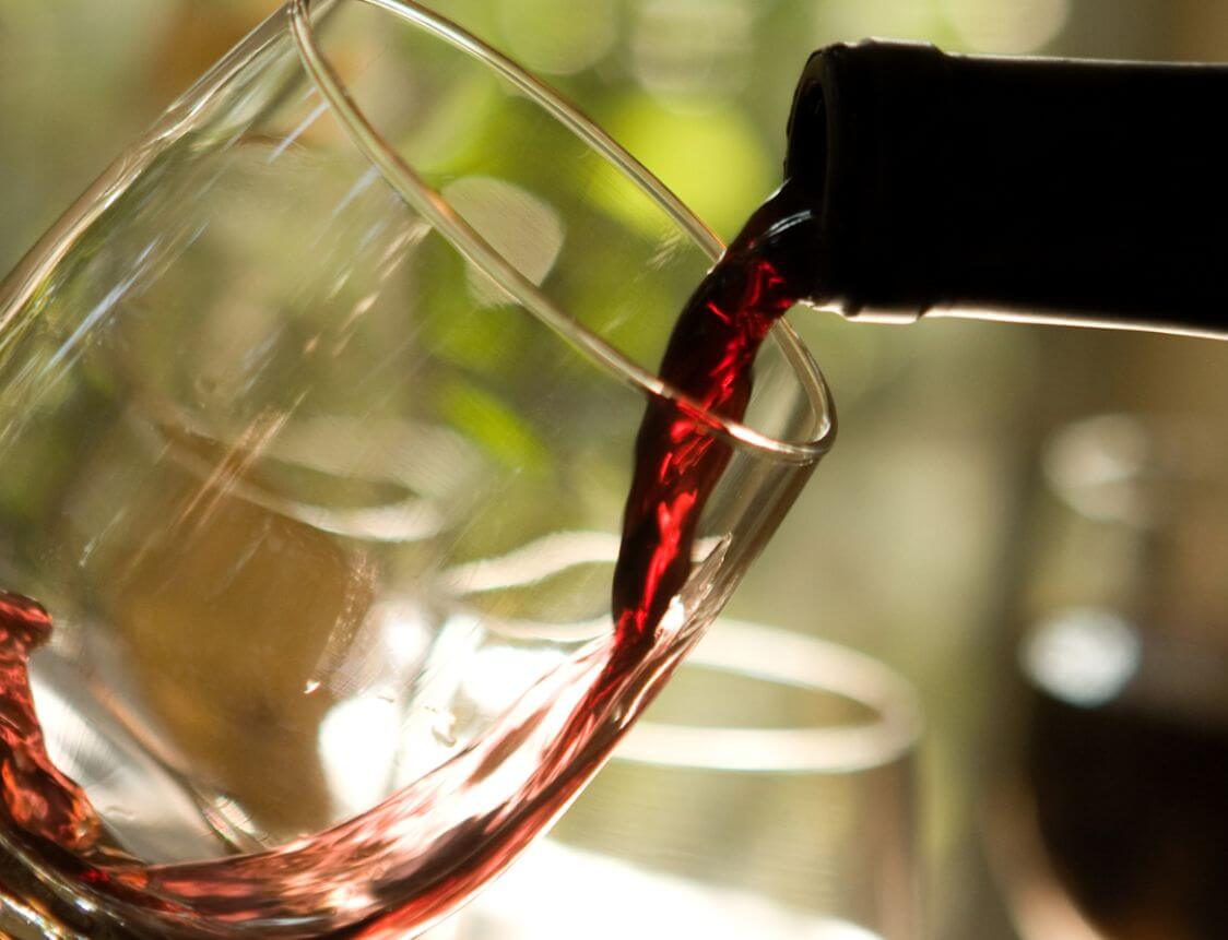
Red and Sweetness
Red foods—like strawberries, tomatoes, and cherries—are often perceived as sweeter than they actually are. This is because red signals ripeness and warmth, setting up an expectation of indulgent flavor. Even in savory dishes, red elements can evoke a sense of richness and comfort.
Yellow and Sweetness
Like red, yellow is tied to perceptions of sweetness. Foods such as bananas, corn, and certain fruits visually prime us to expect a sugary, mellow flavor. Yellow also adds a sense of optimism and energy to the plate.
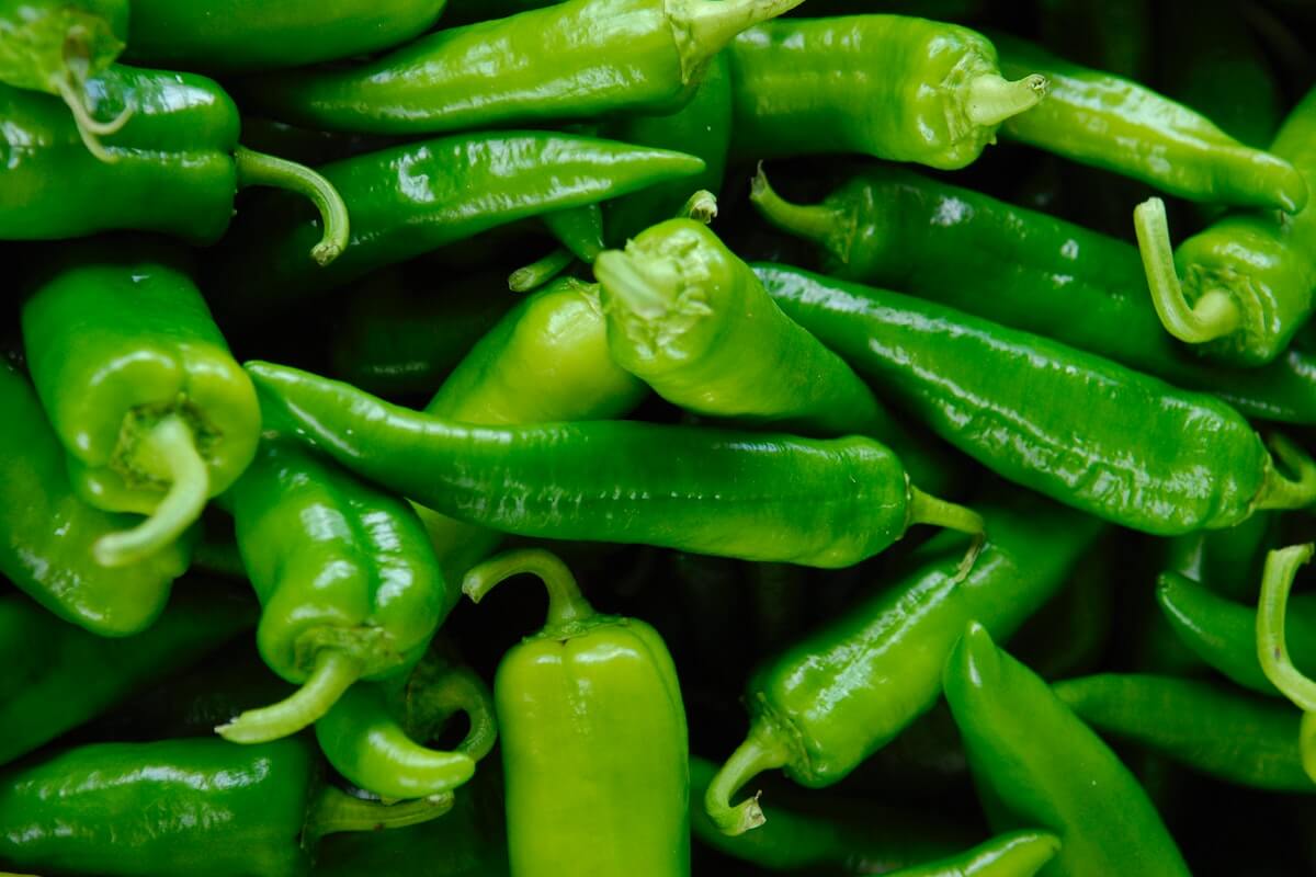
Green and Freshness/Bitterness
Green symbolizes vitality and nature. Foods like spinach, kale, and cucumbers are associated with freshness—but also bitterness. This dual perception shapes how we taste green-colored items: as earthy, clean, or mildly astringent.
Blue and Sweetness (or Caution)
Because blue is rare in nature, it often surprises our senses. When used in candies or beverages, it can amplify perceived sweetness due to its artificial novelty. But in more natural contexts, blue can elicit caution, lowering appetite and altering flavor expectations.
Cognitive Bias: The Mind’s Influence on Taste
Our brains are wired to expect specific flavors based on the colors we see—a cognitive bias that significantly shapes taste. For example, a green drink may be automatically interpreted as lime or mint, even if it actually tastes like cucumber.
This expectation leads us to “taste” what we believe we will taste, making visual presentation a powerful tool. A splash of red in a tart dessert might make it feel more indulgent; a golden hue in a drink might suggest a hint of sweetness that isn’t actually present.
Artificial Colors and Taste Perception
Artificial coloring is frequently used in sweets and beverages to enhance visual appeal and manipulate taste perception. Neon pinks, blues, and greens often imply intensified sweetness or fruitiness—even when the actual flavor is mild.
In some cultures, vibrant colors in food are equated with quality. For example, in Japan, brightly colored dishes are seen as a mark of craftsmanship and high culinary standards. These colors communicate freshness, precision, and aesthetic care—often before a single bite is taken.
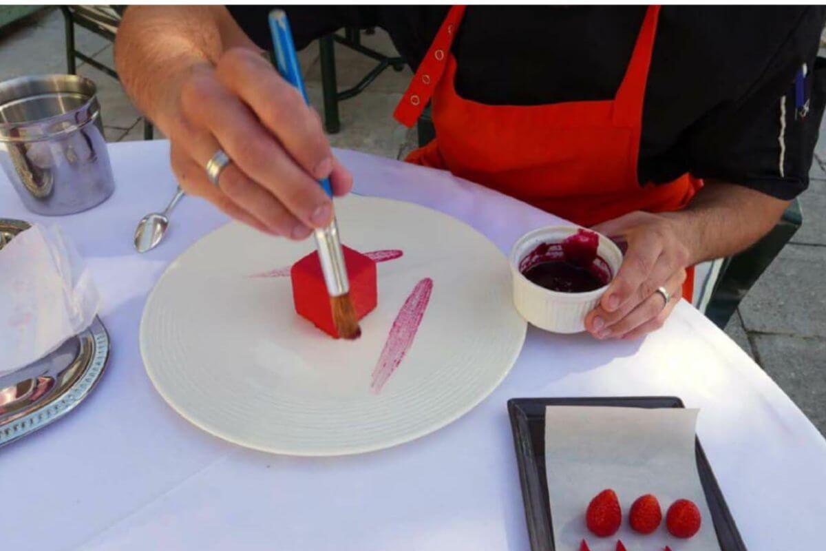
The Poetics of Color in Culinary Design
Colors on a plate do more than please the eye—they tell a story. Like an artist with a palette, a chef uses color to elicit emotion. Rich browns and reds might evoke the comfort of a winter stew, while citrus yellows and fresh greens suggest a light, summery escape.
Contrasting colors add energy and vibrancy.
Monochromatic palettes bring elegance and harmony.
These choices aren’t random—they are integral to deepening emotional engagement and heightening sensory perception.
The Silent Power of Color in Crafting Unforgettable Culinary Experiences
Color is not a superficial detail—it’s an essential part of the dining experience. It shapes expectations, guides taste, and influences emotion. By mastering the art of color, chefs can elevate their dishes from delicious to unforgettable.
In a world where every detail counts, color becomes a quiet yet powerful player in the pursuit of culinary excellence.